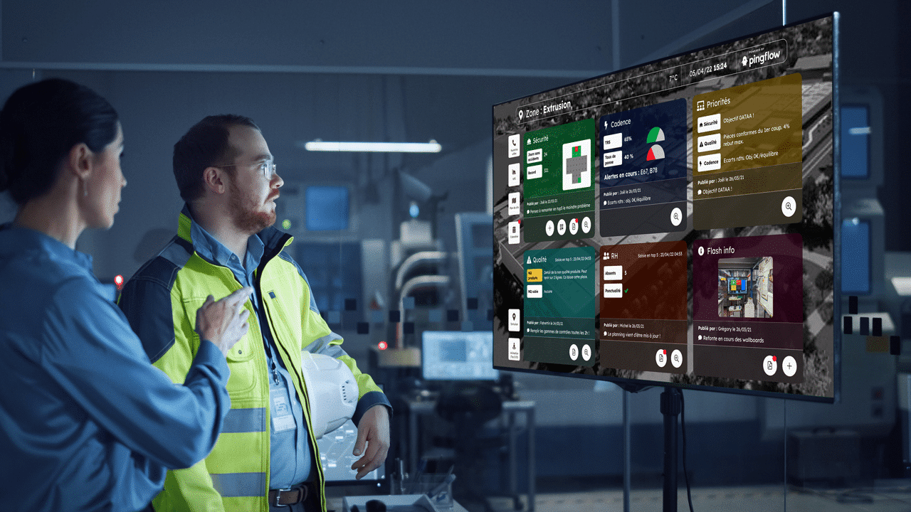
Displaying an effective real-time dashboard
A real-time dashboard has a role of activities management with the highlighting of key performance indicators. For a team to be effective, it is essential that key elements are shared within the team so that they can be exploited in depth and collaboratively.
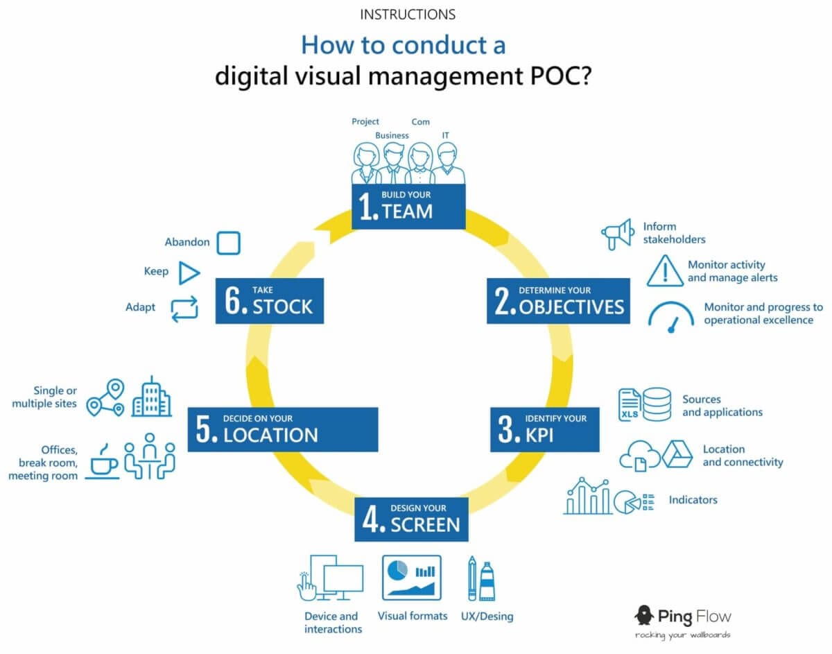
We will therefore see what elements need to be taken into account when creating a real-time dashboard.
1/ Synthetic
The dashboard is not a report and should not include all of your data. Its objective is to be a management tool and therefore the surplus of information has no interest.
The main quality of the dashboard lies in its ability to reproduce the KPI concisely. If you want more comprehensive and detailed reporting with more important indicators, the dashboard is not necessarily the solution.
2/ Adapted
Display the right data for the right people! There is no universal dashboard and it cannot fulfill its role if it is not adapted to its target. In order to guarantee the performance and relevance of a dashboard, we must first of all ensure that it adapts to the business line and to the needs of everyone. You can obviously start by adding a few universal indicators, but keep in mind that you will have to be more relevant if you want your dashboard to have real value.
Take the time to choose your KPI and adapt them to your needs and those of your employees. Remember that the dashboard serves the collective and not the individual.
3/ Stable
After defining the KPI, this information must be updated in real time so that your dashboard is reliable. Your staff will refer to it every day and any erroneous data could have serious consequences. Also, avoid big changes so as not to destabilize your team. Once the data is established, avoid modifying it or if unavoidable, inform the parties concerned.
4/ Visual
Your staff will probably tell you that they do not have time to consult the dashboards and that they are too complicated. To do this, you just have to play on the data vizualisation. Indeed, the graphics and gauges are more talkative than sequences of numbers. Don’t hesitate to use several colors and set animation conditions to energize your dashboard.
5/ Commented
Even if your collaborators know and say they understand the data put forward, do not hesitate to comment them all together. Some people don’t always ask questions, so be proactive and listen. Finally, it is not because your employees see these KPI that they will necessarily take the time to analyze them and reuse them in their work. Explain to them the interest and comment on the evolution with a vocabulary adapted to the interlocutor. Do not hesitate to popularize your language.
6/ Contextualised
A data has no value if it is not put in a context that allows it to be evaluated and compared. You must always put your KPI in context. This will help you avoid misinterpretation.
Do not hesitate to add additional information that could explain the evolution of the data at a time t. For example, the weather which made the sale of summer shoes rise.
7/ Intelligible
Make a simple real-time dashboard and care for the visual aspect for effective visual management. The design of the dashboard is just as important as the data it contains. Indeed, reading it must be comprehensible at first glance. Intuitivity is the key to any good dashboard.
8/ Avaible on request
In an activity management context, the data must be accessible immediately. The data should be real-time regardless of whether the dashboard is accessed daily or weekly. The employee must not ask you for an update or he would lose all his interest. It is up to you to ensure that it is updated automatically using a SaaS solution for example.
9/ And specially useful!
The point of this article is that the purpose of the real-time dashboard is to make decisions while managing an activity. If it is not consulted or the information is not easy to understand and not updated regularly, then it becomes useless.
If you have already created your dashboard but you have a doubt about its interest, take the points one by one and compare them to your dashboard. You’ll probably find a solution.
Pingflow offers an efficient and dynamic SaaS digital visual management solution and support to guide you and meet your needs.