Transforming your workspace into a digital workplace requires a solution which displays key operational indicators to your teams. You will easily find solutions such as Business Intelligence (BI), Data Visualisation (dataviz) and Visual Management. Difficult to tell them apart; they can seem very similar. In reality, they all have very different objectives. They are a little like Batman, Superman Wonder Woman.Each has its superpower, and together they are sufficiently complimentary to form a Justice League.
Business intelligence: The strategic superhero
Business intelligence resembles data visualisation and Visual Management due to presentation. All three solutions can present aesthetic dashboards, diagrams or other graphical representations. But the final objectives are very different.
Business intelligence is ‘decision tools’ in French. Business intelligence is the collective set of tools and methods for use by managers and
company directors. The objective is to supply strategic decisionmaking information based on data collected in the information system or by field staff.
Data Visualisation: The charming side of data
Data Visualisation, more commonly known as dataviz, is the art of representing complex data in graphs and tables, etc. The interface is often aesthetic–this is the added value of dataviz.
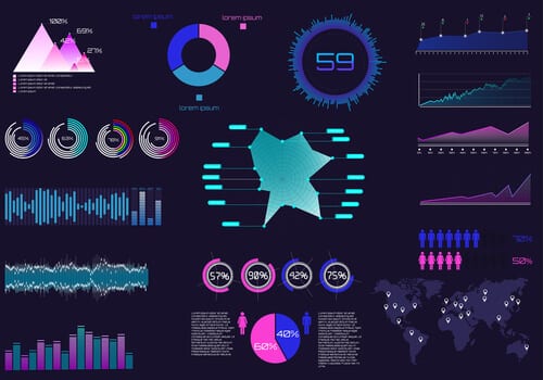
Remember your geography lessons in college or secondary school? Your books were full of planets with colour population charts by country. That’s dataviz. Instead of communicating complex raw data, they are presented in the form of a planetary sphere with colour gradients. It’s the same principle for companies, but the data is often much more complex. That is why presenting a diagram is more intelligible and accessible to management.
Visual management: The Robin Hood of operational data
Just as Robin Hood stole from the rich to give to the poor, Visual Management gives back control of the data to operational staff (normally reserved for strategic decision makers). Derived from lean management, it includes dynamic displays accessible to operational personnel. The idea is to have an ergonomic interface to make the data more attractive and accessible to teams. It helps operational teams evaluate their KPIs as part of their daily management.
If Visual Management was traditionally about paper noticeboards in factories, today’s digital systems can support operational activity in real time and improve the reactivity of corrective actions.
Thus although BI and dataviz are similar in presentation, they have very different objectives. And very different target audiences: BI and dataviz for strategic activity and Visual Management for operations. Visual management also uses a tool commonly known as the wallboard.